_projects
Multimedia
For the first semester of our Multimedia module, we had to create and edit different multimedia elements following some given requirements. Most involved a chosen city which, in my case, was my hometown Granada. These have been useful in better understanding graphic design and the tools that can be used.
Logo
Having your profile contoured and your name or initials on it.
Look at the process here.
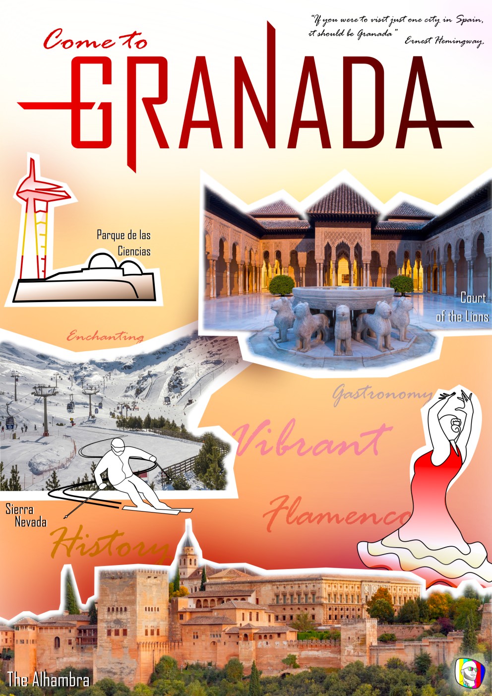
City brochure
Including minimum two line art and two clipped images of landmarks of the city.

Look at the process here.
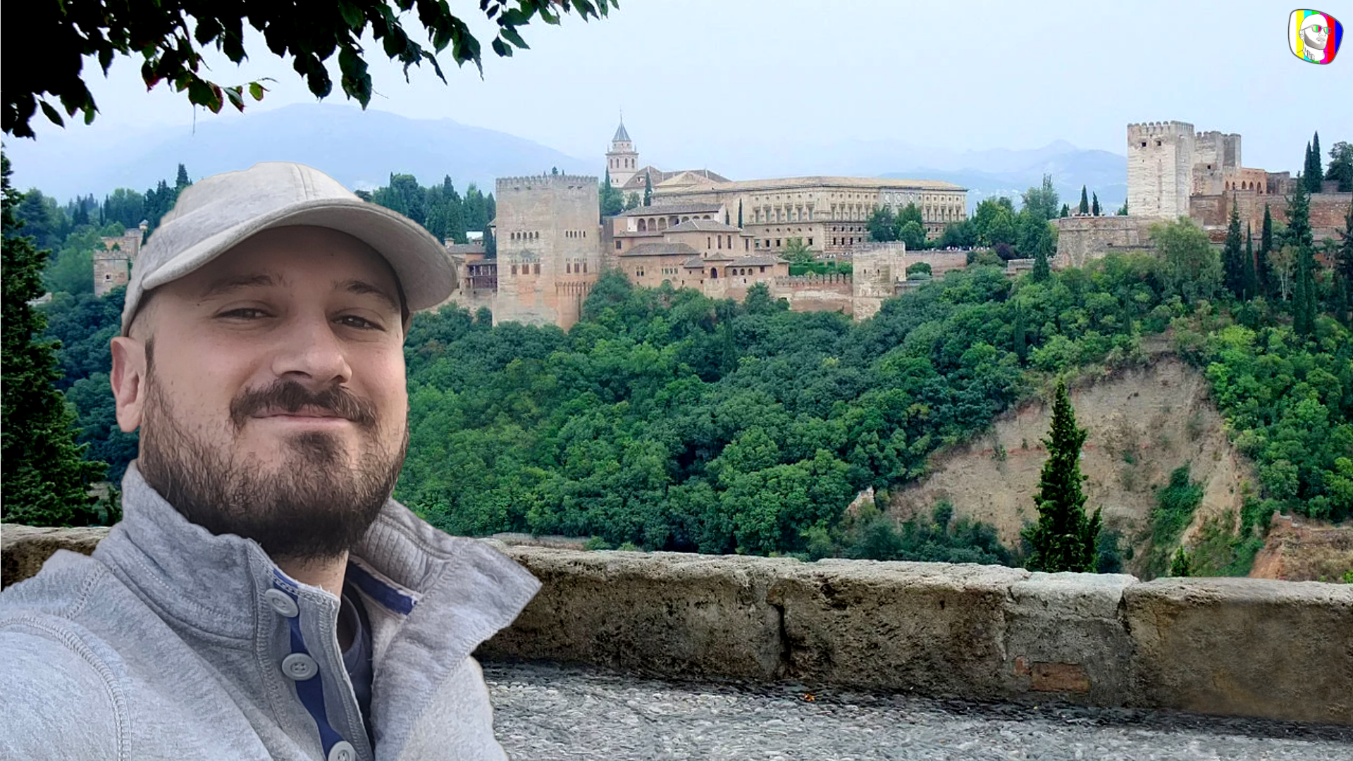
Images editing
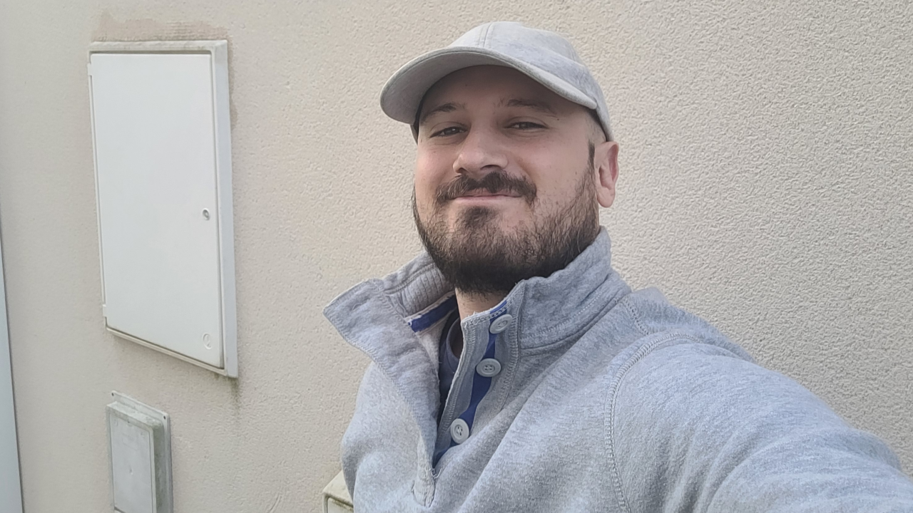
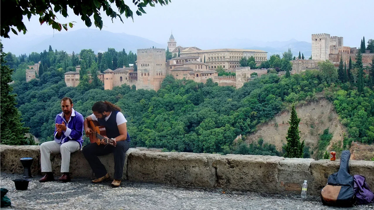
Cropping yourself into a picture of your city and removing elements from the original picture.


Video editing
The video had to be less than one minute long, have at least three landmarks of the city (and minimum five images each). The used song had to be of spanish origin. If video parts were used they shouldn't last longer than 20s in total.
Animation
Create an animation video (à la South Park style) consisting of two characters having a conversation about me having been to Granada and displaying my fake edited photo from the previous assignment.
Warning: cringe central.
Web Development
In case you haven't noticed it yet (or didn't read the home page), you are actually navigating through my main Web Development project! Yes, that's it. For my first semester of Web Dev I created this website from scratch. I'm very proud of it, as not more than two months before it I barely knew what HTML and CSS stood for.
If you think your eyes can take it, you can always visit my first ever webpage I created here.
A bit basic? Definitely... Functional? Sure!
I'll hold on to it as a future reminder of what a couple months, some effort and a good teacher* can do.
*An example is how we learned to apply cascade stylesheets: we had to create a CSS file for a style-less html file we were given about addicted hens: Hypnotherapy for hens! Bananas.